Art?

The previous logo on tumbledry meant absolutely nothing (just like the ones before it). I still liked the way it looked but … as a recognizable widget, it really accomplished nothing. Additionally, I had been using the first take on my color scheme since about July of last year. As a side note: indeed, taking a design from the drawing board to live takes about 6 months. Well, it takes me sixth months because I have all these other hairbrained ideas on the journey. That said, I noticed some serious problems with the color scheme. The ratios of green to red to blue were completely wrong. Half the time things looked like a bad version of Christmas with some blue tossed in. So, a concerted (minor) graphic refresh was undertaken.
The presence of red has been reduced markedly, such that greens and blues now dominate the colors. Furthermore, I’m especially happy with the logo. I’ve had this idea for the logo rolling around in my head for about three years (previously rendered using square brackets), and I’ve sketched it out at various points along the way. Here’s a version from 2003:

This time, it all finally came together. The logo is a stylized representation of the tumble dry icon. It is set in ITC Kabel, and because it is composed of typographic characters, it has the advantage of being able to be rendered in plain text, thus: {o}. Anyhow, a simple tilt at an angle, followed by an application of the wicked worn look, and there you go!
Finally, I accidentally threw these graphic refresh files online a bit early, so there’s no navigation at this point in time. Have no fear, tumbledry will regain navigation in the next couple of days. In the meantime, hope you all like it.
Beer/Soda Can Earrings - I particularly like the Sunkist ones, though I am unsure if Mykala will feel the same.

Come In, Go Away Mat - Well now how about that. As you walk in, the mat looks like it says “Come In.” However, as you walk out, it reads “Go away.”
It’s called an ambigram.
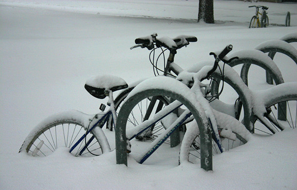
These won’t be going anywhere for a while. Let’s hope they still work in the spring!
On campus today, I saw a kid with a sweatshirt that said “Holy Angels Football.” I thought it would be funny if they renamed the school “Holy Angles,” just for the comedic effect for the football team name. “Holy Angles Football” sounds funny … like they have the perfect angles … or something. Though, the name would work best for a pool league. “The Holy Angles Pool Players League Of Awesomeness”.

↓ More
