Y’z’ing Up
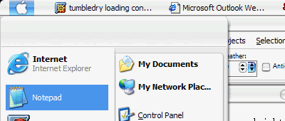
Recently, I stumbled into an intriguing area of computing: skinning the Windows GUI. Now, I went nuts for a while, downloading every theme by KoL off of deviantART, grabbing StyleXP, evaluating if it really did use the same amount of system resources as the normal GUI, and generally having a field day. Actually, once I had selected a theme I liked, I chose to disable StyleXPService.exe in control panel > administrative tools > services in order to remove all remnants of the program running in the background. (Edit: Disabling StyleXPService.exe does save about 2 megs of background memory, but when you restart your computer, things are no longer skinned. I will live with it running in the background, then.) Now, I truly feel comfortable with the GUI skinning. After trying many themes, I eventually decided to skin the computer to look like a bit like OS X. This decision was not based on any conscious preference between the Apple and Windows operating system appearances, I simply liked the way that the “Smooth Stripes 4” scheme had been implemented. In fact, I liked it so much so that I moved the taskbar to the top of the screen, to match the style I saw in the screen shots of the skins.

For a while, it was good. The start menu was up top, I occasionally missed and hit the clock instead of the windows’ “x,” but things looked lovely. I realized something was missing. Where was my dock? How on earth could I emulate a dock on Windows?
Enter Y’z dock. Quick research yielded exactly the information I wanted. That is, Y’z dock so closely emulates the functionality of the Mac OS X dock, that the developer of the program was sent a cease and desist order by Apple. Thus, it took some work to track down this bit of software (and for legal reasons, I can not tell you whether I actually found it). Speaking hypothetically, then, Y’z dock is a fantastic program. Using the resources at dockEX, one can add weather and other great functions onto the dock. Therefore, one could theoretically clear off one’s entire desktop (and quicklaunch bar), move program shortcuts to the dock, and move the trash and my computer shortcuts as well. Once again, deviantART was an invaluable resources for the icon files, although I made my own AT&T globe icon using a vector version of the logo and saving it as a *.tiff file. You can make all of your own icons, if you want. Furthermore, the dock can live on the top, bottom, left, or right side of your screen. From left to right: AOL IM, Recycle Bin, weather, clock.

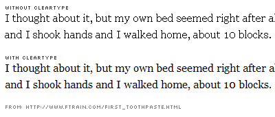
Hold on, there was one more thing to do. Look closely at the text on tumbledry right now. If you are on a Windows machine you will see jagged edges on fonts. See how the text is composed of hard, pixelated lines? Well, Microsoft and Apple did, too. Apple’s solution to this jagged text problem is on by default in their operating system, Microsoft’s solution is off by default. Try turning it on once: I dare you. Here’s how: right click on the desktop > properties > apperance tab > effects. Under the heading “Use the following method to smooth the edges of screen fonts,” select the “ClearType” option. Click OK and then Apply. Windows will pause for a moment, and then things will look different. Notice the edges of text. Take special note of fonts such as Times New Roman - try chatting on your favorite software, you’ll definitely notice a difference. Now, this ClearType method has not been perfected, but in the long run it is designed to make text easier to read. Do your eyes a favor and try it for a day. Trust me, it does take some getting used to, but once you do, the difference is amazing. Reading is easier, your eyes fatigue much more slowly, and things simply look cleaner.

Regardless, I sincerely hope I convinced you to try at least one thing: StyleXP, Y’z dock, or at least ClearType (if only for a little bit). It is a sin that so many people work on machines that look the exactly the same. Individuality and variety are the “spices of life,” and they should be present not only on our real workspaces, but also in our virtual ones.