Typographic Opinion: Arial
How much do I have to plead with the college paper writers out there? How much do I have to explain about readability, fonts designed for the screen, and resolution to get my point across? Arial does not print well. Please, please, gets down and knees and continues please, please use a different font. Maybe it will be Times New Roman. That is fine - that font was inspired by a font used for printing. Arial is designed to look good at 72 pixels per inch (your friendly local computer monitor). On the other hand, the effective resolution for a printer is far higher - and thus printing opens up a whole other world of font possiblities.
Franklin Gothic is one of the most popular sans serif fonts ever produced. It was designed by the famous type designer Morris Fuller Benton in 1903. The font was named for Benjamin Franklin.
In spite of its long history, Franklin Gothic is still a standard choice for use in newspapers and advertising. It is also frequently seen in posters, placards, and any place with space restrictions.
- MyFonts.com
Now, I could open up Pandora’s box and start in with a debate between the readability of serif and sans-serif fonts, but all I am saying is this: Arial is the son of a turbulent marriage between Franklin Gothic and the ugly Monitor.
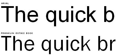
Notice the gracefulness with which the parts of the letters are joined? To my untrained eye, Franklin Gothic Book simply looks better proportioned and easier on the eyes. So, given the choice, please choose wisely.