typography
You are viewing stuff tagged with typography.
You are viewing stuff tagged with typography.
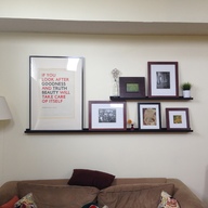
The left picture was printed five years ago by Hand & Eye letterpress in wood and metal type in a run of 80 prints. It is a rather odd size, and necessitated a custom mat. This is the first we have gotten to hang it up, because it sat rolled up in tissue paper in its mailing tube for years while I waited to get it professionally matted. Eventually, we decided that I should simply cut the mat myself and we would make do with this Ikea frame for the time being. Mykala’s efforts got this to finally see the light of day, for which I am very thankful. It is not perfect, but it turned out nicely for a first crack, and I’ll take it for now. I tend to just stand in front of the wall and stare at it, because I like the way it turned out.
For about the past twelve months, I’ve been convinced that I could design a better tumbledry than the one you see in front of you. With help from Mykala, Hoefler & Frere Jones, and Dive Into HTML5, that idea of improvement is becoming reality. I’m excited.

Lots of elegant little details in a city as old as Amsterdam.
Charles Apple provides great before and after comparisons between the old and new Saint Paul Pioneer Press designs. I could live with the Myriad (har) of typefaces used in the new design, if only they didn’t use the face Stainless. That one is driving be absolutely batty. Every time I look at it, I’m thinking Star-Trek type computer screen displays; it’s too sharp and computer-like.
They’re not fonts! explains the difference between “font” and “typeface.”
Graphic designers choose typefaces for their projects but use fonts to create the finished art.
The Esquire magazine logotype, by Jim Parkinson Type Design with Roger Black and Ann Pomeroy, is without a doubt the best magazine logotype I can think of right now. So. Great.

Recently, there have been foolish comparisons of web design to other design fields. “Where are the canonical, genre defining designs?” was the main question posed. This question necessitated tacit and explicit comparisons of web design to fundamentally different fields, such as static graphic design. The folly of comparing apples to oranges and expecting logical results have been debunked thoroughly and well:
Want to make an Old West style wanted poster? Well, Clarendon would be your typeface of choice. See it (or a very similar derivative of it) used to great effect on the tremendously well-designed site for 31Three, the design studio of Jesse Bennett-Chamberlain.
Linkin Park’s newest album Minutes to Midnight has what I consider to be almost perfect cover art. The band is presented in a graphically strong yet photographically interesting way and there is an absolutely stunning logotype set above their heads. Said logotype is constructed from a relentlessly powerful typeface, with a treatment reminiscent of the famous Metallica logo. It actually looks like the Metallica logo grew up, matured, got a job, and combed its hair but still has a solid core of attitude and rock.
Hypatia Sans - Combines the feel of Kabel and Mostra with some classical proportions… I really like it.
Music typography - I have got to find some time to sit down and read this article. Particularly fascinating are the pictures of actual real metal typesetting of music. An amazing art that typesetting, I wonder how close it is to being lost.
Come In, Go Away Mat - Well now how about that. As you walk in, the mat looks like it says “Come In.” However, as you walk out, it reads “Go away.”
It’s called an ambigram.

I always liked the typography and graphic design on this little label. I find myself sometimes more interested in the materials, artificial aging, graphis, and fonts of the labels of these clothes than I do the clothes themselves - these people really know how to brand.
Best free fonts - Very useful list of 20 quality free fonts. I can personally vouch for Blue Highway … and Lacuna looks awesome.
Holy good lord. Tarnation. Yikes. Gosh golly. Good night that took a long time. I remember saying July 4th this would be done, a deadline I shamefully blew through and which Nils could have yelled at me for. At last, I don’t believe it (you most certainly do not, either), but it is done. The great tumbledry redesign of 2005 is ACTUALLY DONE. I’ve been spending so much time on this that its hard to know where to start. I can say: look forward to one image per day in the imageLog, actual updates, and more.
Typographica - My favorite journal of typography, a field into which I occasionally delve. Typographica serves as an excellent portal to other typographic resources.