The Fickle Perception of Beauty
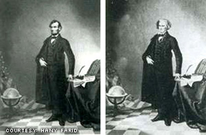
The art and science of photograph manipulation and retouching has been evolving for years. And by “years,” I mean for around 150 years. Consider the first example from that link above: Abraham Lincoln’s head is the only original part from Lincoln—his body comes from another photograph of John C. Calhoun. Want to talk about tasteless? How about grafting the head of Lincoln, the man integral to the Emancipation Proclamation, onto the body of a guy famous for his pro-slavery opinions?

While this infamous dagguerotype-era body grafting makes more recent photographic alterations of celebrities seem pretty meaningless, the widespread use of Photoshop has caused many to call into question the accuracy of news photography. The scary thing about that example linked is how intensely bad the photo editing job is. I’ve used the exact tool in the exact program that these hacks used … and believe me, it doesn’t take much skill. How many doctored photographs circulate each day, undetected simply because they’ve been produced by professionals?
This would be less of an issue if not for the unconscious perception (that persists to this day) of photograph as objective truth, despite the endless computer manipulations that are now more convenient (and as a result more widespread) than ever before. Spend 30 minutes reading anything about photography, and you’ll surely run across the fact that simple framing choices in a shot are plenty to alter reality. But, for whatever reason, the unexamined photograph on the newsstand speaks to people as a record of what Is, and not what Was Interpreted. For this reason, news organizations have strove to avoid retouching, implementing strict limitations on what is acceptable (generally only levels adjustment).
Surprisingly, though, this post isn’t intended to be about the history of photograph retouching, its effect on news outlets, or even the misleading nature of extensive manipulation. It’s about some recent frighteningly ugly photoshops that have been going around. Somebody in charge at some movie study asked for every single thing making the person in the photograph human to be removed. And they got their wish. And the results are awful. Consider The Superficial’s recent post about weird Jessica Alba retouching:
It’s like they couldn’t get her for the Fantastic Four photoshoot so they just drew her in. Only they got confused and used a picture of Denise Richards as reference. They could’ve put Chris Rock in there and it would’ve looked more like her.
Mr. Superficial is pretty spot on here—the picture looked awful. So, as my brain was primed to be looking for these weird retouches, it came upon one when researching Judd Apatow for my last post. He’s the director of all those funny films mentioned, and he’s coming out with another picture called Knocked Up, which stars most of the folks from The 40 Year Old Virgin. (And apparently tumbledry has turned into a big ad for him as a director; so it goes with my interests. Hopefully one of these movies is halfway good, otherwise a couple of months from now, I’ll have to warn you all not to see them.)
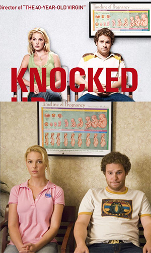
The picture of awful retouching is actually a part of a version of the Knocked Up movie poster found on Apple’s trailer website. Befuddled that Katherine Heigl didn’t seem to look like herself at the trailer splash page, I investigated, looking for an analogous picture, which I found at IMDB.
So, above we have Katherine Heigl as herself (bottom) and as a zombie product of endless Photoshop filters and manipulations (…top). Two things I’d like to point out here:
- Somebody slimmed down Heigl’s arms so much that they look like little toothpick twiggy sticks of sticky twigness. I don’t know anybody who really jumps at the balsa wood look. I would think it would be difficult to be a woman with arms that thin: “I try to pick things up, but my arms keep snapping! It’s most frustrating.”
- I didn’t know it was possible to digitally add 10 layers of make-up to a picture, but somebody managed to do it. And I think it was a guy. Because I don’t think a woman could make make-up look so wrong. I understand and acknowledge the need for extensive make-up in movie shooting settings, but I really have to question the rational behind the super-airbrushed post processing look … the person looks like wax and not a human!
So, if the goal here is to eliminate perfections and idealize beauty … somebody’s ideal is some sort of robotic plastic thing. Which is sad, because when these people go overboard on the retouching, they’re actively detracting from the appeal of the picture. Extremely counter-productive. So, by paying less to have fewer retouches performed, there could have been a better final picture produced.
Now, the acid test, as it were. I’ll show you a picture of Heigl that, I guarantee has been processed less than the previous picture. An important distinction, “processed less,”—this picture, I would imagine, has certainly been processed. I’d credit whoever took it and ask them about processing if I could, but frankly I have no idea. So, you tell me which you like better: lot’s o’ processing or less of the processing-fu.

Controlling for the fact that it’s up a rather revealing photo of Heigl, I think you might agree that the less-retouched one looks like a better picture. As a sidenote: consider my cropping options for this one: if I did neck up, you wouldn’t have any fair comparison to the other photographs. If I did shoulders up, she’d look naked … which would distract you from my main point. So I went with this crop, which is the best I could do. I suppose I might have skewed the results a bit with the picture choice. Hey, I’m proving a point here—give me a break!
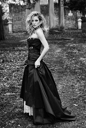
Oh, and an important note for those of you who might think that I have some ‘thing’ for Heigl … you would be wrong. If I had some set of ulterior motives, I would do an extended essay about Kate Hudson. And I would include this photograph.


Comments
Nils +1
1.) Katherine Heigl is hot.
2.) That “picture” of “Jessica Alba” in the link looks nothing like Jessica Alba.
3.) I am with you on hating the plastic look over the super-airbrushed photoshopping.
4.) I am as tall as Abe Lincoln was.
That’s about it.
Nils
What the? Why did those numbers get messed up and why did the font size triple? We’ve got a rogue website on our hands.
Alexander Micek
lol. I fixed it for now—it’s a … “known issue.” We’ll fix it up in time. :)