How to Use Tumbledry
In the past eight years, this website has evolved from an extremely simple, unchanging outline of an adolescent kid to a dynamic web of text, links, sights, and (at times) sounds chronicling a young adult’s life. All of this extra content has necessitated extra layers of complexity. As sections have been added, I’ve tried to keep it simple, but it has certainly been a challenge — and I haven’t always succeeded. So, for anyone new to tumbledry or curious how it all works, let’s run down the basics.
TumbleTools
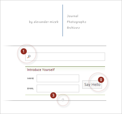
Tumbledry doesn’t have a list of “recent journals” or “recent (anythings)’s” like it did before. In this current incarnation, tumbledry only tells you what’s new when, for you, there are new things. This is where the drop down menu (let’s call it “TumbleTools,” — controlled by the arrow (3) in the image below), comes into play. TumbleTools only pops open when two things are both true:
- There is something new since you last visited.
- You are visiting the front page.
As a result of these regulations, this “list of new things” in “TumbleTools” follows you around the site until you visit the front page again. However, this list is generally hidden, but it’s always just a click of that arrow away. Ah, but there are a couple of more interesting things contained within TumbleTools…
Introduce Yourself
Due to lack of descriptive text, this feature is a little confusing - but it should immediately become clear upon explanation. You provide your name and an email address as a sort of introduction from you to tumbledry (illustrated at (2) in the image below). When you do this, tumbledry remembers you by this name and email address. Just like in the real world, there is no email follow-up or further contact after introduction. Tumbledry just remembers you, plain and simple. The convenience afforded to you by this feature is that you never have to type in your name or email address again. Your info will show up in all relevant forms on the website. The introduction feature is therefore two things: a time saver and a personalization feature. This brings us to our next topic.
Personalization
As you leave comments in discussions on tumbledry, and receive votes (a feature discussed later in this document) on them, tumbledry keeps track of your statistics for your particular name and email address. When you reintroduce yourself on other computers or revisit the website, you’ll receive an update on how you are doing. Your rank and the number of votes you have garnered will be reported. Rank is summarized by the number of bullets a user receives next to his or her name; these bullets are called “irons,” and were explicated quite thoroughly at their introduction. In short, promotions occur at your first 20 comments, and for every 125 comments after that. These stats are an attempt to distinguish veterans from new-comers, ultimately allowing the casual visitor to decide which comments to trust the most.
Search
The search box, another part of TumbleTools, is labeled (1) in the image below, and you can use it in one of two ways. First, try typing your search and waiting. A list of the most recent matches to your search will pop up, and you can click away. In order to display a full, exhaustive, list of search results, just hit enter. Finally, as a shortcut, you can simply type your query directly in the address bar. If I wanted to search for “Hawaii,” for example, I would type this: http://www.tumbledry.org/search/hawaii. It’s a helpful shortcut if you have to find something fast.
Voting
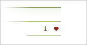
Signified by the heart icon (seen in the image below), voting is the newest feature at tumbledry. It’s purpose is more frivolous than user ranking — it’s a simplistic positive feedback mechanism that allows users to “heart” other comments that they have enjoyed. One vote is allowed per hour, and voting is shut off along with comments after two weeks.
Navigation
Finally, you may navigate sections of the website using the text at the far top right. Note that your options are limited — this is entirely intentional and will hopefully simplify navigation and minimize confusion.
Please leave questions and remarks about all this in the comments, I’ll do my best to explain anything I’ve forgotten and to rationalize any design choices that may initially flummox you.
Comments
Richard
The new design is pretty slick. The only thing is i accidently hearted myself before i knew what they meant and now i feel guilty.