Rebirth
Please skip to the fourth paragraph if you are not curious about the technical details of what has been going on here. You have been warned. Originally, I was just going to surprise you guys with this design and not mention any of the details. However, it has been such an interesting time, I figured I would share. As I said to Justin, I almost went insane doing this redesign. Here’s the sequences of events: I was bumming around in Paint Shop Pro (as I have been known to do) and brought up a scanned photo of Largent off of a Kodak Picture CD. I said to myself, “self, this could look good with a properly applied brush filter.” In a fateful sequence of menu choices and button clicks, I applied said filter and discovered it looked good - really good. Good enough to continue bumming, this time with a full draft space of 8.5 by 11 inches (‘round about 1224 by 1584 pixels when using a resolution of 144pixels/inch - but that’s for printing so don’t mind that). Then, things began to get out of hand. Recently, I had scanned the cover of my Shakespaeare book.

I realized I could use the textures. Thus, this text is set against is a high resolution crop and seamless filter of the paper on that cover. Furthermore, the red ragged edge behind the navigation was made by editing the woven cover of the book. Just to document (because I know I will forget), I first started a new layer over the red. Then, I drew randomly sized anti-aliased circles. After this, I used the cutout effect (offset by 1px in both directions, with a limited amount of blur) to give the holes some depth. Then, I shrunk the selection by 1px and dropped a shadow with similar settings to the cutout. Finally, all I had to do was use the smudge brush with hardness set to around 80 to roughen up the neat holes. As you can see, the process results in a nice ragged and frayed edge. I stumbled upon this technique completely by accident. The back background is my sweater, actually. The one I got for Christmas appeared on that same Photo CD, so I also brush effected that one and made it seamless. Voila, background. The heading bars are colorized versions of the scanned Shakespeare. Now the CSS began. The entire idea was to keep the underlying XHTML, but change the stylesheet only. Thus, I would have the possibility of using a stylesheet switcher. This ended up working out (after much ado, and adding about 4 tags to the design). Making it work was tough. As I explained to Justin, I am most proud of my image overlay. That top header is two images. The background is one, and the “tumbledry.org” text is another. The second image is a transparent GIF governed by a different tag. I soon realized my only option to get them to overlay was using the position: relative; feature. Unfortunately, the rules behind this position are thus:
The area’s position is determined as if it was normally stacked. Only during rendering is the area rendered offset relative to this position. The fact that one area is relatively positioned does not influence the position on any other area.
So, my #masthead (as I called the div of the top logo) could be moved around with the relative property, but everything else would flow/stack around it as if it had not been moved at all. This would translate to a 70px gap between my head/nav area and the rest of the document. Seventy pixels of vertical, wasted space is a like an abyss to a designer - simply not an option. After hours of pounding through this, I had an epiphany. I could move everything (meaning the border container, called #tupperware) up by 70px. Then, my #masthead could be moved down by 70px to make it align with the top of the page. At this point, I shifted the div containing the original transparent image up 70px and then things were be even. Thus, the 70px was shifted to to a place where you couldn’t see it; the bottom of the page. Take a look, go ahead don’t be shy, there are 70px hanging out at the bottom of the page. My mind is still a little fuzzy on why this works (if you understood all that on the first [or even ninth] time through, I fear you), but thank God it does. Inevitably, I encountered the usual CSS glitches when trying to get Mozilla and IE (with its retarded implementation of the box model) to reconcile their difference’s and work together for a common render. I was able to avoid the Tantek Celik hack but I did utilize Fahrner image replacement (which is elegantly great I might add, and I don’t care about it’s drawbacks) to display the text “tumbledry.org :: issn pending” in the original design and then to make that disappear in this new design. Yay. My final CSS problem was my image galleries. The tables are (for whatever insane reason I had in the past) designed to act like dynamic tables, adding columns as page width increases. I wanted to keep that - why I did that in a completely fixed width design is beyond me. Anyways, the float: left; property gave me all sorts of trouble. How to get it to stop floating? It didn’t stop floating until it reached the #footer’s clear:both; instruction. Not soon enough buster (the parchment background didn’t stretch and as a result my gallery was laid out over the sweater image … not pretty). So, I was able to find a page about containing those floats where you want and implemented that. Basically, it involved adding a hr tag directly after the image gallery. This tag was then set to not be visible and to end the float with a clear:both;. Problem solved. Everything else was moderately simple (apart from IE’s background problems). Yes, that’s right. Those vertical bars (see the headings) are images that are vertically tiled. IE doesn’t like vertically tiled background images and in fact displays them quite randomly in certain settings if you don’t set a width. Therefore, in order to get it to display consistently, I had to add percent widths. Why? I have no idea. But that’s what I did, and it works. Good. Final thing. The style switcher. I ended up using a backward comptatible style switcher to change styles. It refreshes the page, unlike my first choice. Matt and Shayla say the QuickMail isn’t changing styles. I am not sure why this is. I hope it is some obscure IE setting having to do with iframes or temp files that will be rectified when files get cleared out. I hope. So far, things have been tested in Mozilla, Mozilla Firebird, IE 6 for Win XP, and IE 6 for Win 2000. If you have access to IE 5.x, I am very curious if it works correctly there. I sure hope it does. I downloaded a version of IE 5.x, but haven’t gotten a chance to test it. That’s about all on that for now. Maybe a little more later.
John and I had an interesting chat. He is having … he is having times. Definitely collegiate times for John. I can’t be any more specific. Top secret. You know.
Me (3:07:53 PM): this weekend
Me (3:07:54 PM): i think so
John (3:08:04 PM): which girl?
John (3:08:27 PM): did she break your tri-cuspid valve???!!!
Me (3:08:47 PM): YES!!
Me (3:08:48 PM): it hurt
Me (3:08:49 PM): a lot.
We get to do some DDR with a metal pad this weekend. I can not wait. God bless metal pads. That’s the second God bless statement for this post, if you are counting.
Ah me, what else. Yes, I got into Dashboard’s latest album again. Go Go Lyrics!
I am feeling agile
I can bend and not break
But I can break and take it with a smile
And I am so resilient
I recover quickly
I’ll convince you soon that I am fine
I have said in the past just about everything there is to say about this album. However, it remains a layered album with real depth and feeling. Driving at the right times, pensive at the right times.
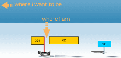
Online game time! Matt attempted to break into the four-hundreds as Nils said was possible, but those numbers seem elusive.
Is that a metaphor for life? Shayla said no. I think possibly otherwise. Don’t you? Then again, why look ahead when we can hang out on a snow bank and consider our surroundings? I like my surroundings. A lot. Primarily, I like the lack of a roomate and the tremendous square footage. But, that’s a different story. Whatever is happening with your roomate; you have to believe me, I understand and sympathize. Who said vicarious knowledge wasn’t worthwhile?
I am going to bed. I am sleeping. Tomorrow I am getting up and attacking the day. Try this; don’t look at the clock when you go to bed. That way, you don’t know how many hours of sleep you got. It’s better that way, believe me. Math could tell you that you got 3 hours of sleep; this doesn’t matter as long as you tell yourself it was 8 hours. So far, this theory only works for sleeping; it didn’t seem to quite work the same way on my bank account.